How to boost conversion rates by keeping visitors on your website
By Axia Public RelationsAugust 2, 2022
 If you have a website for your brand or company, you likely want to convert your site visitors into paying customers. The more website visitors you get, the higher the probability of converting them into customers. Higher conversion rates equal more sales and better profit margins at the end of the day.
The longer you can keep your website’s visitors on your site, the more you will increase your conversion rates and brand recognition in the long term. You will need to follow a few golden rules to achieve this and keep your audience coming back for more.
Audio: Listen to this article.
Understanding bounce rate
The bounce rate refers to the number of visitors who leave your website after visiting a single page. Bounce rate is usually described as a percentage and can help you assess the overall engagement between your website and its visitors.
So, for instance, a bounce rate of 25% indicates that a quarter of your website’s visitors aren’t checking out any other pages on your site before they click away. The lower your site’s bounce rate, the better. The more your visitors navigate through your site and check out your landing pages and product pages, the more likely it is they’re moving through the sales funnel.
Bounce rate is important because it tells you how well people are engaging with your online content and whether or not they’re enjoying the experience.
There are other factors to consider when optimizing your website to help keep your visitors around. That said, improving your bounce rate can show your efforts are successful and more of your visitors are engaging with your website.
5 ways to keep visitors clicking
-
Use themes and visual design
Your website’s theme and design should enable visitors to navigate through your site quickly and easily. If you do not design with usability in mind, your website might frustrate and confuse your visitors. As a result, they’ll end up leaving your site.
Choosing simple, user-friendly themes with strong color contrasts, legible fonts, and bold headlines will help your site to stand out and capture your target audience’s attention.
Your chosen theme and design should enable you to keep your on-site content well organized and indexed. It should group content in ways that make it easy for visitors to find what they are looking for, access related resources, and scroll through your content with ease.
Bear font and font size in mind, too. Your font should be simple and clearly legible for best results, and it must be large enough for most people to read without having to squint or struggle.
Another way to keep your visitors engaged with your owned media is to make your content scannable. Most people want to read content that is concise, to the point, and ideally summarized.
Make your content easier to read by adding numbered lists, bullet points, and summaries that will allow your readers to get the gist of your webpages without having to read them in-depth if they don’t have the time or inclination.
-
Write honest and captivating headlines
If you promise to relay certain information in your headlines, you must uphold those pledges.
For instance, if you write a blog post titled, “3 unique ways to prune bonsai trees to encourage growth,” you need to include all this information – unique pruning methods, how they encourage growth, and why you recommend them – in your post.
Giving your visitors the exact information they want will help establish your website as an authority in your sector and will keep users coming back.
Internet users today are especially wary of clickbait and will leave a site almost immediately if its content doesn’t match its heading. No matter how well you write your headlines, most people will simply click away if your content doesn’t meet their expectations.
- Keep your headlines brief, descriptive, and displayed in a bold and easy-to-read font.

- Use subheadings to divide long portions of content and help your visitors find exactly what they are looking for to keep them engaged.
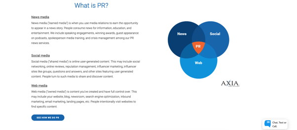
- Create an FAQ page for your site to show your audience that you are addressing their needs and are eager to teach them how to make the most of your site.

- Provide an overview of your company, your website, and common questions to bolster interest in your products and services and streamline your customer service operations at the same time.

-
Add Videos
Video content is the most popular form of digital media today and is essential to most companies’ marketing strategies, and digital marketers have found that it helps to foster increased engagement among website visitors.
Make sure your videos are relevant to your industry and brand, your target audiences, and their specific needs and preferences. Videos like product reviews and how-tos help to establish your brand as an authority and provide your audience with valuable information in an immersive and novel format.
There are many different web plug-ins you can use to add videos to your website without compromising its speed or functionality. For example, WordPress users can use the free tool Smart YouTube PRO to link YouTube and social media videos to their sites.
Must Read: 3 tips for getting started with social media influencers
-
Minimize webpage loading times
Your website’s loading time should never exceed a few seconds. The modern internet user has an attention span of roughly 8.25 seconds, and if your site takes longer than this to load, your visitors may simply click away.
What slows down a website’s loading time?
- Data-intensive elements
- High definition images
- Animations
- Embedded videos
- Resource intensive plug-ins
- Redundant code
Try to keep these elements to a minimum, choose videos and visual effects carefully, and avoid using pop-up ads on your site as they can slow it down and annoy your audience. If your website showcases a large number of images, optimize every image to load quickly. A regular site audit can identify any of these stumbling blocks so you can remove them quickly and efficiently.
-
Include a call to action
Your visitors may not naturally know what to do next after reading your content, and calls to action can guide them logically through your site and can convert them into customers.
Decide which visitor actions will be most valuable to you, like newsletter sign-ups, navigation to your online shop, and contact-form requests. Once you’ve pinpointed your purpose, use CTAs to encourage your visitors to take those actions after viewing a specific page. Include bold, visible CTA buttons your visitors can click on to take the next step.
Static CTA buttons have been popular for years. But nowadays, more and more website owners are finding that static buttons are not enough to encourage visitors to take the ideal next steps. They blend into most sites’ designs and aren’t animated or eye-catching enough to encourage people to notice them.
Many designers have now started using CTA buttons or slide-in opt-in forms instead, which capture readers’ attention and compel them to act without interrupting their browsing experiences like a pop-up ad would.
Static linked CTA:
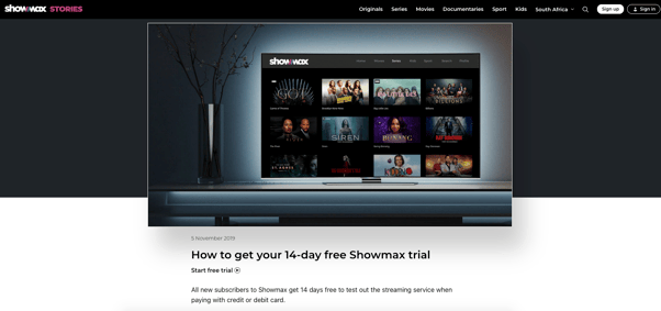
Image source: How to get your 14-day free Showmax trial
Dynamic CTA:
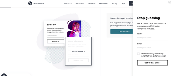
Image source: Best Call-to-Action Words for an Email Sign Up Button to Increase Conversions
It’s crucial to link to other pages on your site to keep your visitors curious about your content. If your website offers related topics, link to them strategically to keep your visitors clicking through your site and following your calls to action.
To learn more about increasing your online traffic and attracting leads, download our e-book about inbound marketing and customer conversion for more expert advice from Axia Public Relations.
First photo by Marek Levak
Topics: owned media, web media

Comment on This Article